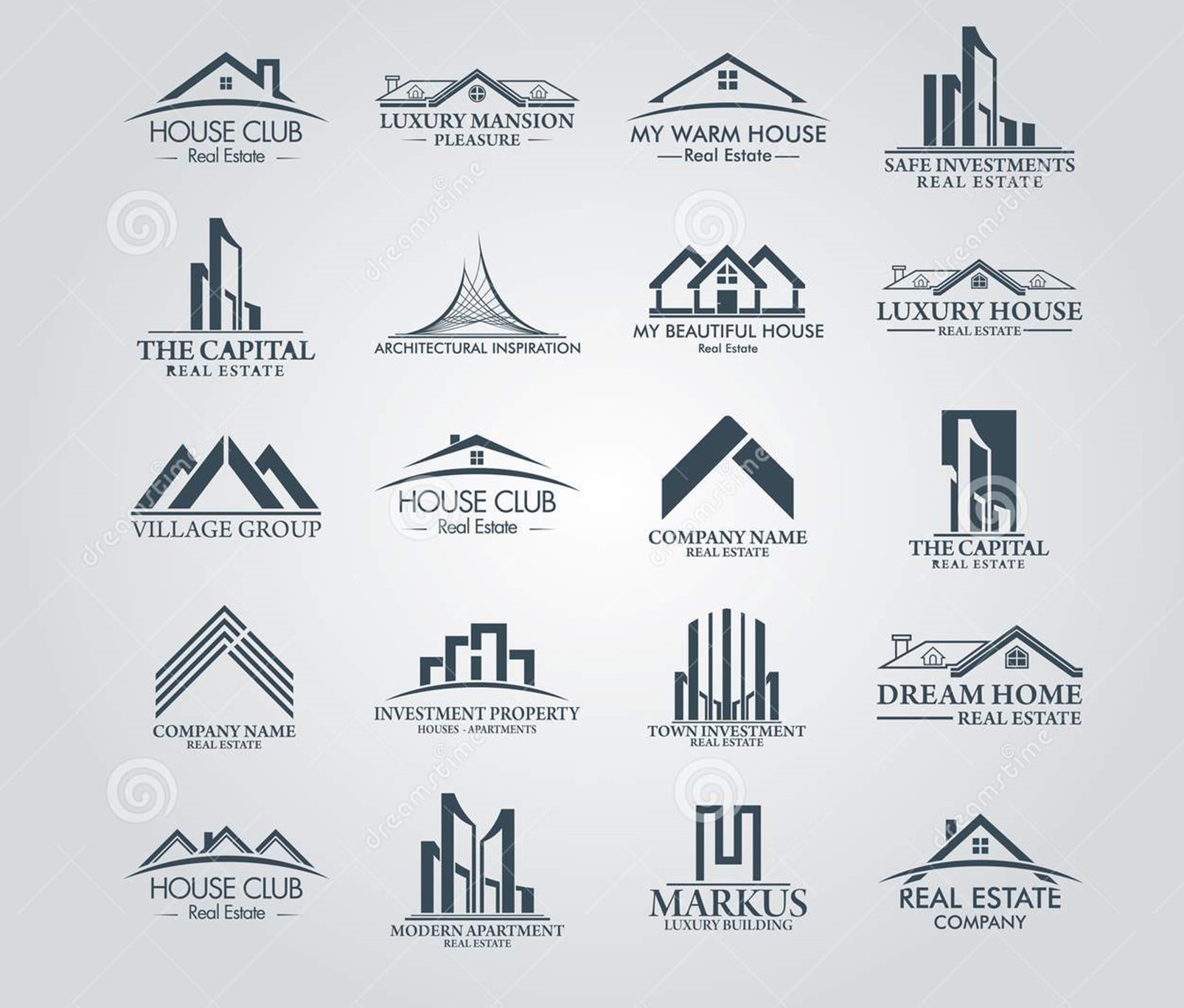
Starting a new construction company from scratch? You require a strong construction company logo. Rebranding an existing business? You require a good choice from a selection of construction logos. You don't have to do it alone in either case! With the construction logo ideas we've curated here, we're here to help you find inspiration.
A well-designed construction logo communicates that your firm is qualified for the job. Clients are looking at a lot of logos and getting a lot of estimates, quotes, and ideas when they're looking for the right contractor for their project.
When they see your logo, it should give them the impression that you know what you're doing, leading to a consultation call where you can really sell your promise.
What characteristics define good construction logos?
Consider what clients expect from construction contractors to get a sense of what makes a good construction logo. Building, renovating, updating, or even performing routine maintenance on a structure is a large, expensive project that requires technical considerations and specialized skills that most clients lack. The contractor has a lot of power in a contractor-client relationship. The client must have faith in the contractor, so you must instill that faith in them.
Your customers rely on you to:
- Complete their projects on time and on budget.
- On-time completion of their projects.
- Fulfill their project expectations.
- Follow all local building codes.
- Finish their projects without any issues.
- Maintain a secure work environment.
- Deliver sturdy structures that will last.
Your logo, as the face of your company, should reinforce all of these qualities and more.
Good construction logos instill confidence in the brand's ability to meet the client's needs, but how a brand accomplishes this varies depending on the type of clientele it seeks.
You're no stranger to niching down as a construction professional. A good logo for your business is one that connects with clients looking for work in your industry.
A perfect logo for a tile installer who creates custom kitchen and bathroom designs for property owners on the wealthy side of town will look a lot different than the ideal logo for a roofer whose bread and butter is mid-tier commercial buildings.
However, all construction logos, regardless of their aesthetic differences, must communicate trust.
Solid Ideas For Construction Logos
What You See is What You Get
Being literal has no negative connotations. Sometimes the best logo for your business is one that simply states what you do.
There are a few options for doing so. Your logo can be a fully realized scene depicting all of the details of what your company does, or it can be a single object or a minimalist illustration of what you do. These hyper-focused logos are ideal for businesses that specialize in one thing and do it exceptionally well. These logos don't leave any room for speculation or imagination; they simply tell the world what you do.
Good, old-fashioned quality
There are no wrong ways to do things in some industries. There is in construction. Using an old-fashioned logo evokes nostalgia for the "good old days," when things were built to last, whether your industry uses time-honed techniques or you're on the cutting edge and innovating every year. By using a vintage logo, you can show the world that your company values old-fashioned values like hard work, truthfulness, and fairness.
These logos are especially well-suited to businesses that specialize in preserving historic structures and designing new structures with a classic, timeless feel—or structures designed to appear as if they were plucked from a bygone era.
Designed to be contemporary
A modern construction logo, on the other hand, communicates that you employ the most recent advancements in your field and that you use these modern technologies to better serve your clients. If your style is, well, modern—or if you find ways to incorporate modern technologies and conveniences into older structures—use a modern construction logo. Solar panel installers, green architects, and builders tasked with revitalizing town centers with new luxury apartments are just a few examples of construction fields that look great with modern logos. A modern logo is perfect for an innovator.
The majority of modern logos are abstract. Some of these are so good that you can't tell they're construction logos. Pay attention to what they're saying about their brands with color, shape, and font choices, even if they're not clearly saying "construction."

The company's face
Construction can be a chilly business. Your hands and your equipment do the majority of your work, and a job well done is one that delivers exactly what the client requested with minimal disruption to their schedule. Many construction professionals do a good job, so how do you avoid getting lost in a sea of logos that say the same thing?
By putting a literal face on yours. Clients are more likely to connect with your brand if it has a face. It feels more approachable and personal, which is exactly what you want if you've built your brand on client collaboration.
Construct it - make it fun
Let's face it, making things is enjoyable. Legos would not be as popular if it wasn't. Why not play around with your logo? You can be professional and take your work seriously while still having fun—and your logo should reflect that.
Smaller businesses and companies that specialize in creative, somewhat "out there" work benefit greatly from offbeat, fun construction logos.
This could be a custom pool builder or a floor installer who creates unique spaces with colorful poured epoxy floors. If you have a specific niche, a creative logo can be the hyperfocused laser that tells potential clients, "I'm here, and I have the skills to handle your super-specific project."
The fundamentals of logo design
It can be difficult to create a construction logo if you have no prior experience. So, let's take a look at the fundamentals of logo design (using apps) or otherwise.
Logo design is a subfield of graphic design. It necessitates an understanding of aesthetics, branding and marketing, composition, typography, and color theory, as well as the artistic ability to bring all of these elements together in a cohesive manner.
How to design a logo
Here are some key points to remember when it comes to logo design:
Design with your brand in mind. There is no single "best" type of logo to employ. Your company's best logo is one that perfectly communicates your brand. Consider the Home Depot logo and how it communicates the niche it fills and the products it sells. Consider how Home Depot would be viewed differently if it used the same font and color scheme as Taco Bell.
Wouldn't it tell a completely different story?
You must first establish your brand identity before you can begin designing a logo.
Are you a traditional builder who focuses on classic styles, or a forward-thinking company that builds LEED certified homes? Your responses to questions like these will inform your design decisions, particularly your color palette, shapes, and lettering.
Letters, colors, and shapes. Every color, like every shape, evokes a different feeling. A black logo, for example, appears sophisticated, whereas a brown logo appears trustworthy. A star-shaped logo is whimsical and fun, whereas a triangle is focused.
The same can be said for your font selections. A courier-style font is retro, whereas a bold, all-caps font is ready to go. Every design decision you make has an impact on your brand, so choose wisely as you build your brand from the ground up.
How to get a construction logo
As we discussed in our guide on comparing the best ways to get a logo designed, there are four main ways to get a logo designed.
- Make your own logo. You create a logo with basic computer tools and templates using entry-level design software.
- Engage a design firm. You delegate the entire process of designing your logo to a team of experts at an agency.
- Consult a freelancer. You work with a single logo designer to create your logo, gaining access to a professional's skills without paying the agency's fees.
- Organize a design competition. You give general instructions for what you want in a logo, and multiple designers from around the world submit samples based on your specifications. Then you pick your favorite and work directly with the designer to create a final image.
When is it appropriate to use a DIY logo maker? Only in extreme circumstances, such as when you're on a shoestring budget. Your logo is your company's calling card, and it may not be as effective as it could be if it isn't designed by a professional. That does not imply that you must spend the entire month's budget on logo design.
Design competitions are popular because they tap into the creativity of multiple designers. Consider it as a contract bidding process: each designer who enters a contest submits a unique interpretation of the contest host's brief, providing the contest host with a variety of logo options to choose from.
Are you ready to get a construction logo that stands out?
Whatever industry you're in, a great logo communicates to everyone—clients and competitors—that your company is a major player. Making the investment your company deserves by having a professional logo designed is better than settling for a mediocre logo. We'll walk you through every step of the process, from figuring out who you are as a brand to finding a designer who can perfectly illustrate your brand, with a perfect selection of construction logos for you.
Construction logo idea FAQs
What makes a good logo?
A good logo has a strong sense of aesthetic. Essentially, logos must be attractive and easy to read in addition to being unique. They should entice people to examine and understand them and how they represent the brand. This serves an important purpose: a strong sense of the logo can often lead to a strong sense of the brand.
What can I do to make my logo look more modern?
Modern logos tend to have bold colors paired with black or white to stay on trend. You can create a cleaner impression of your brand by limiting your color palette to no more than 1 or 2 colors. If you choose to use more than two colors, keep the rest of your logo's design elements simple.
What should be included in a logo?
A good logo should have a design that reflects your brand personality, a style that is consistent with your identity, your company name, and an appropriate color scheme.
Please leave a useful comment with your thoughts, then share this on your Facebook group(s) who would find this useful and let's reap the benefits together. Thank you for sharing and being nice!
Disclosure: This page may contain links to external sites for products which we love and wholeheartedly recommend. If you buy products we suggest, we may earn a referral fee. Such fees do not influence our recommendations and we do not accept payments for positive reviews.


