![]()
So, you'd like to create a logo for your business or organization. But do you know how to design a logo? Our absolute first recommendation is to hire or commission a designer if you have the financial means - and it won't cost you much if you go here - from as little as $5!
Many people thing that designing a logo is simple, but any good designer will tell you that it is not. It's rare that the design process is easy or simple.
Furthermore, you get what you pay for, and we would suggest that you to have the best possible experience and result when it comes to designing your logo!
However, if you need to start developing your brand's visual identity and can't afford to hire a designer, we're here to help.
We asked three designers with a combined experience of more than 25 years to show us how they create a logo, so that you can apply the logic when you are learning how to design a logo.
You might be surprised by what they said.
What exactly is a logo?
![]()
This question most likely conjures up images of a famous swoosh or an apple that has been bitten into. After all, we're all familiar with the concept of a logo.
A logo is a symbol or design that is used to identify a business or organization, as well as its products, services, and employees, among other things.
A logo, in its most basic form, identifies. It's how people will remember and recognize your company. It also serves as the public face of your company.
Your logo can also serve as a platform for making a statement about your company. Take, for example, Amazon.
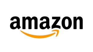
The smiley arrow conveys that the company sells everything from "A-Z" and also represents how satisfied customers are when shopping with them.
One caveat is that a logo can, but does not have to, convey a deeper meaning. In fact, most businesses that are having trouble deciding on a logo are putting too much pressure on themselves.
So keep in mind that while a logo is important, it isn't everything.
A logo isn’t
Your brand
This is a common misunderstanding, but your logo is not the same as your brand. And your logo isn't your brand.
Your reputation—what people think of when they hear your name, what they tell others about you, and how you make them feel—is intangible. Your brand is made up of a thousand customer touchpoints, not just a logo.
Your distinctive visual style
"You don't just need a logo, you need a brand identity," a good designer will tell a new company or organization when they request a logo.
Logos are an important part of the picture, but they aren't everything. They're just one part of a larger visual system that includes your colors, typography, photography, visuals, and layout, among other things.
An indicator of success
Your company's logo isn't going to make or break it. The logo of Enron was attractive, but the company's ethical code was not.
Two Men and a Truck is a multibillion-dollar corporation with a logo that was drawn on a napkin by the founders' mother.
The best logo in the world won't save a crooked business, and the worst logo won't keep an honest one from succeeding.
Let's get started on the design process now that we know what a logo can and can't do.
![]()
What is the best way to design a logo?
Here are two things to remember as we get started:
- A lot of strategy goes into design. Yes, you will be required to create a visual at some point. However, the majority of the work, especially at the start, is strategic. Prepare to think and make decisions in addition to drawing.
- You aren't just creating a logo. Remember that the logo is only one component of a larger visual system, and all of its components must work together.
You'll need to work in stages to get this right. While each designer's process is unique, the one we'll be guiding you through has five stages:
- Discover
- Explore
- Design
- Refine
- Define
Every phase has its own objective, process, and output. We'll go over why each phase is important, the series of actions or steps you'll need to complete, and the final deliverable you'll need for the next step.
1. Discover
Goal
The "question" phase is part of the discovery phase. Designers use this time to elicit as much context and history as possible in order to fully comprehend their client's company or organization, including its values, business, brand attributes, and so on.
This is also the time to ask any pre-design questions you have about the desired look and feel, all possible use-cases, and any must-haves or special requests.
This will be more of a period of self-discovery for you. Your goal is to have a firm grasp on who your company/organization is, what you stand for, what you want to achieve, and how you plan to get there.
Keep in mind that you're not just creating a logo. You're forming the identity of your company.
While you may believe you already know these things, I recommend that you write down your answers. I'm guessing there are some things you haven't thought about.
Process
Consider the following questions:
- What are your reasons for wanting and/or needing a new logo? What is the driving force behind this design?
- What is the significance of your company's name?
- Who are the people you want to reach out to?
- Who are your main competitors?
- What do you hope to achieve with this new logo? What criteria will be used to determine "success"?
- Who do you consider to be your top 3-5 brand "role models"? Whose appearance and demeanor do you admire?
- When people see your logo, how do you want them to feel?
- What values do you want your brand to represent?
- What distinguishes your brand's personality from others?
Is your brand refined, curious, nostalgic, vibrant, and so on?
This is a fantastic resource to help you learn more about this topic.
- What will the logo/visual system's primary applications be? Is it a social media site or a website? T-shirts?
It's all about the context!
- Are there any special requests or must-haves that you'd like to see incorporated into the design? Is there anything you want to keep from the previous iteration if you're doing a visual refresh?
Deliverable
You'll summarize your answers in a creative strategy that provides a general overview of your business after you've answered these questions.
Include your design process goal, brand tone, visual considerations, and an early vision for the design system and logo, as well as any themes that surfaced during this phase.
You'll use this strategy document to not only guide your next phase, but also to assess your progress throughout the process. At the end of each phase, assess how well your deliverables meet the vision set forth in the creative strategy.
Refer back to this document to stay objective when personal opinions and preferences inevitably arise.
2. Explore
Goal
This is the stage of your research, but "exploration" sounds more exciting. And it will be, we assure you. The exploration phase may be the most enjoyable and helpful for someone who is embarking on this design process alone and possibly for the first time.
In essence, you'll be focusing your attention outward to encounter and explore design in the real world. Your objective is twofold: Educate yourself and be inspired.
Process
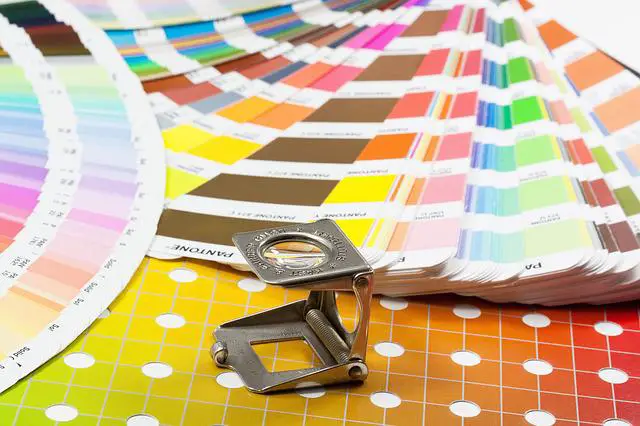
Begin by looking up basic design principles on the internet. Study the fundamentals of design, such as style, color, and typography.
Certain color theory principles, according to our designers, can be especially useful for logo design.
Different colors elicit different emotions and behaviors, which can help you elicit the emotional response you want from your audience. It's really fascinating stuff.
Blue, for instance, evokes feelings of trust, dependability, and authority. Blue is a popular color for banks, credit cards, and software for a reason.
Green evokes feelings of tranquility, growth, and well-being. Green is used in the branding of companies like Whole Foods and BP to strategically communicate a level of environmental concern.
Find out which color will make your audience feel the way you want them to.
Begin gathering information once you've mastered the fundamentals. Look at your immediate competitors first, then your entire industry. Don't limit yourself to logos.
Observe brands across multiple channels, such as the website, various social media networks, and so on, to get a sense of the entire visual system.
Make a mental note of everything. What elements, both good and bad, stand out to you?
Next, look for opportunities outside of your field. Take a look at what's hot in the design world. Look for recent creative work from the world's top designers on websites like Dribbble, Behance, and Brand New.
On Instagram, look for #logodesign or other related hashtags. 99designs also has a discover page that you might find useful for design inspiration.
Deliverable
Make a mood board to collect all of the images, designs, color combinations, photos, illustrations, and, yes, logos that appealed to you and represent the appearance you want for your brand identity.
You can make an actual board by cutting and pasting printed images if you're feeling crafty. However, the majority of designers prefer to work in the digital realm.
Pinterest is the simplest way to collect, but if you need to share or review your images quickly, simply copy and paste them into a document.
Create separate mood boards for each design direction if you're drawn to more than one. Include brief descriptions of how the visual choices on each board express the brand attributes listed in your creative strategy. In an ideal world, you'd show these boards to other team members or a decision-maker, and they'd help you narrow down your options.
3. Design
Goal
Finally! The goal is simple: combine all of the considerations and inputs from the previous two phases and begin creating logo designs.
Process
When thinking about how to design a logo, there are a lot of factors to consider:
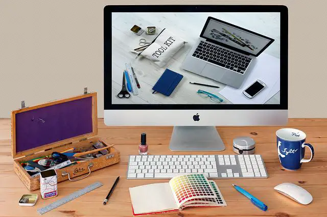
Logo Design Tools
Make sure you have everything you'll need to design before you begin:
Paper and pencil
It's a good idea to start by sketching some preliminary ideas. Don't make it too difficult for yourself. Iterative design is a method of creating something.
Create rough sketches of the ideas in your head, even if you don't think you can draw. Your brain will be compelled to think creatively, which is exactly what you require.
Graphic design software with vectors
Adobe Illustrator is the industry standard for vector graphics editing software, but it isn't cheap and isn't always user-friendly. Similar free tools such as Inkscape and Vectr could be used.
What is the point of vectoring? All logos are vector images, which means they're made up of lines defined by mathematical formulas rather than pixels. Modifying and scaling vectors is much easier.
Fonts
If you choose the first option, you should consider downloading some additional fonts. The Google Fonts library and Font Squirrel are both free font resources.
Fonts can also be purchased from websites such as MyFonts and FontShop.
Free logo design software
There are plenty of online tools to make logos that will get the job done if you're short on time, money, or design skills. Most of these websites have customizable templates, which is the quickest way to create a professional-looking logo.
Just keep in mind that you run the risk of losing your uniqueness.
Last but not least, while the following tools are free, you may have to pay to download the final, scalable vector file.
The following are some of the top online logo design tools:
- Fiverr or Fiverr Logo Design freelancers
- Hatchful
- LogoMakr
- DesignEvo Free Logo Maker
- Canva Logo Maker
- MarkMaker
- Wepik
Different types of logos
Whether you create your logo from scratch or use a template, familiarizing yourself with the seven types of logos is a good place to start.
Word mark
Some brands don't use a graphic symbol and instead put their company or organization's name in the spotlight. Typography is crucial in this case. Whatever font you choose, it must be readable.
Brand mark
Brand marks, also known as "pictorial marks," are the graphic symbol in a logo. These symbols are usually recognisable and help your audience make an instant connection.
For instance, a tooth for a dentist, mountains for an outdoor outfitter, and so on.
Combination mark
This type of logo combines a symbol and a wordmark to create the classic logo "lock-up" that we're all familiar with. Play around with the placement of each element until you come up with a design you like.
In some cases, you can allow for different combinations of the two, which we'll go over in the "Define" phase.
Abstract logo mark
Abstract logo marks, as the name implies, are less recognizable and usually more geometric. They're ideal for creating something completely unique to your company.
Again, until you've established enough brand recognition to let your symbol stand alone, we strongly advise pairing these symbols with your company or organization name.
Letter mark
If your name is long or clumsy, a letter mark, also known as a "monogram" logo, is ideal. You have the option of abbreviating your name or simply using your initials.
In a letter mark, typography is just as important as it is in a word mark. With fewer letters and less concern for legibility, you can be more creative with your styling.
Mascot
A mascot could be entertaining depending on your brand's personality. Plus, because their expressions and contexts can change, they're more adaptable than a standard symbol.
Simply choose a style that corresponds to the message and emotion you want to convey. Mascots aren't a good choice if you want to create a more serious atmosphere.
Emblems
Text appears inside a symbol in emblem logos. Emblems, also known as "crests," have a long history and can communicate prestige and tradition.
Symbols
You may need to do some brainstorming if you decide to use a symbol in your logo, whether traditional or abstract. Here are some pointers from our designers on how to make a symbol that fits your brand:
- Connect the dots. Consider the name of your company or organization and write down as many related words as you can. We'd write words like grow, garden, plant, woods, leaves, twigs, greenhouse, and so on, using Sprout as an example. These words conjure up a variety of images, all of which could be used as a brand mark.
- Consider it in a metaphorical sense. This is where the "Discover" phase's questions come into play. Returning to our Amazon example, the smile represents the happiness and satisfaction of Amazon customers. Think about how you want your audience to feel or the message you want to send. Do any images or symbols come to mind?
- Take things literally. While our designers advised against going with the most obvious option, a literal interpretation of your brand message is still an option. Don't be afraid to experiment with it. Put your own stamp on it. Combine a literal symbol with a more figurative symbol.
- Get a little weird. There are no rules at this point. Think as far as you want outside the box. As the saying goes, that's where the magic happens most of the time. If something doesn't make sense, don't question it. It might be the key to unlocking the winning concept.
- Produce, evaluate, and repeat. You can repeat this process as many times as necessary to narrow down your options. Before they get to the good stuff, most designers go through several rounds. The name of the game is iteration. Don't forget to enlist the assistance of a friend. Sometimes all you need is a pair of fresh eyes to help you get unstuck.
Fonts
If you choose a word mark or a letter mark, keep in mind how important typography is. Fonts, like colors, elicit different interpretations of your brand personality.
There are many different font styles, but they all belong to one of three families (also known as typefaces): serifs, sans serifs, and script.
Serif fonts
Small lines or strokes are attached to the ends of larger strokes in a letter or symbol in serif fonts. These fonts are timeless and can be used to convey trust, tradition, and sophistication.
Sans serif fonts
These are fonts that don't have serifs on the letters. As a result, the line is crisp and clean, and it appears sleek and modern. Because they are easier to read, sans serif fonts are the preferred font family for digital.
Sans serif fonts are the way to go if you want a minimalist design.
Script
Script fonts are designed to look like cursive handwriting, giving the impression of a signature. They often have a more genuine and unique feel to them.
Don't forget to generate, evaluate, and repeat now that you've learned how to design a logo.
Deliverable
At the very least, you should have one logo design to evaluate. At this stage, it's also common to have two or three logos to choose from. We'll go over how to evaluate your designs in greater depth in the next phase.
4. Refine
Goal
If you had several options at the end of the previous phase, now is the time to narrow them down. Have you made up your mind? Great! Let's see how well it works.
Process
Consider the following questions as you evaluate your designs:
What qualities distinguish a great logo?
A great logo is:
- Simple
- Memorable
- Evocative
What will you do with this logo?
Take into account both your primary and secondary use cases, such as printed marketing materials, recruitment and event banners, and so on.
Don't just think about it. Mock it up on a variety of backgrounds to ensure that the image, words, and overall message are consistent across all platforms.
Any logo mark should work in a variety of sizes, but small digital applications are especially important.
Is the logo able to stand out?
Aesthetics shift over time. Trends ebb and flow. However, the value of your logo will only increase over time. Consider whether you think your logo will last you 5, 10, 15, or even 20 years.
Also, think about the logo in the context of the rest of your visual identity. This may necessitate the addition of a new exercise. Take the different elements of your logo design, such as colors, fonts, and styles, and see how you can use them in other places in your use-cases.
Finally, make a single-color, black-and-white version of your logo and make sure it can be reversed on dark colors, as one of our designers stressed. If you don't, you may be setting yourself up for future problems.
Deliverable
You should now have a final logo design that you like. And it's likely that you spent a significant amount of time perfecting every detail. Our fifth and final phase will assist you in ensuring that it remains so.
5. Define
Goal
Quality and consistency are crucial when it comes to maintaining the integrity of your brand identity. Given the number of places your logo will be used—and the number of people who may need to use it—critical it's to establish a set of rules and guidelines for how to handle it.
And there's no way to avoid it.
Process
To begin, think about any guidelines you may have for the size, color, layout, treatment, positioning, and orientation of your logo.
Here are some questions to ponder:
- Is there a specific color palette that your logo should be used with?
- Is it possible to use your logo on top of the photography? If so, could you change the color to make it stand out more?
- Can the elements of a combined logo mark be separated in certain situations?
Don't be afraid to include some "never" rules to discourage any modifications or distortions to your logo to ensure it maintains a strong impact.
Otherwise, you'll end up with a holiday-colored logo on an email sent to your entire customer base of 10,000.
Deliverable
A style guide is a term used to describe this. A style guide can be as basic or as detailed as you require. Sprout's Design Systems team recently created an entire website dedicated to our style guide.
Seeds is the name of the folder that contains all of our brand, writing, and visual guidelines, as well as all of the patterns and components that our product designers will need to build our app.
However, you don't have to create a completely new website to house your brand guidelines. Simply ensure that they are well-communicated to your teams and that they are easily accessible to all.
The majority of designers create a pdf and upload it to their company's or organization's internal resource library.
Conclusion
"Wow, that's a lot," you might think after all of that. We understand how you feel. When we said that designing a logo takes a lot of time, we weren't kidding. Designers usually take weeks to complete all of the phases.
So here's our final piece of advice: don't rush. Take the time to complete the exercises listed under each phase. Your final design will be a reflection of how much time and effort you put into it.
At the end of the day, it's your people who build your brand, not your logo.
How to Design a Logo FAQs
What makes a logo successful?
A successful has a good aesthetic appeal but instantly evokes the raison d'etre of the brand. Aesthetic appeak is a term used to describe how appealing something is to the eye. Logos must be attractive and easy to read in addition to being unique and create a relation with the brand. They should entice people to examine and understand. This serves an important purpose: a strong sense of the logo can often lead to a strong sense of the brand.
Why is it so difficult to create a logo?
Many designers struggle to incorporate all of their clients' suggestions into interesting logos that tell a brand's story while remaining as simple as possible. It's all too easy to get carried away and create a logo that's far too complicated to remember.
Is it necessary to include a tagline in a logo?
No, it isn't necessary to include a tagline. You should not include a tagline in your logo just to be different. You're better off without a phrase if you can't come up with one that's distinct enough to attract your target audience. You can create a tagline as a separate element and then incorporate it into your logo when it makes sense.

Please leave a useful comment with your thoughts, then share this on your Facebook group(s) who would find this useful and let's reap the benefits together. Thank you for sharing and being nice!
Disclosure: This page may contain links to external sites for products which we love and wholeheartedly recommend. If you buy products we suggest, we may earn a referral fee. Such fees do not influence our recommendations and we do not accept payments for positive reviews.